Creating an attractive eCommerce store is one of the crucial parts of your dropshipping business. By setting up your site or product page wisely, receiving more orders day by day will never be that difficult. Recently we invited Elliott Prendy, an experienced expert on eCommerce branding and marketing as our guest. Elliott helped to review 7 Shopify dropshipping stores and gave suggestions for the store owners during our talk. Here we collected all the tips that Elliott mentioned in the video for your reference, also our talk video now has already been uploaded to our YouTube channel, you can have a look anytime. Hopefully, these tips can throw a light on your dropshipping business.
Watch the video version:
Example 1. LUXEOMATIC DESIRE
*Tips from Elliott:
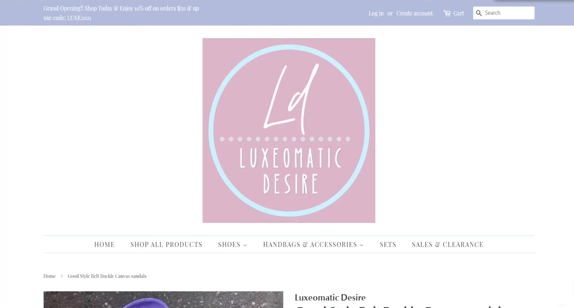
1. Avoid keeping the logo too big to stay on the homepage.
If the logo is way too big when customers come into your store, they may not be able to see any of the products that you are selling since the logo is taking up too much space. You could try to make the logo smaller and keep logos to the left-hand side of the homepage.
2. Homepage images need to be striking.
Try to take and upload some more outstanding product images for your homepage. If the product images are cut off, they can not really demonstrate the products for their main selling point in the best possible ways. By getting some better product images to put for your slider, it makes the customer get some more interest in the product to actually click into it.
3. Enrich the product descriptions.
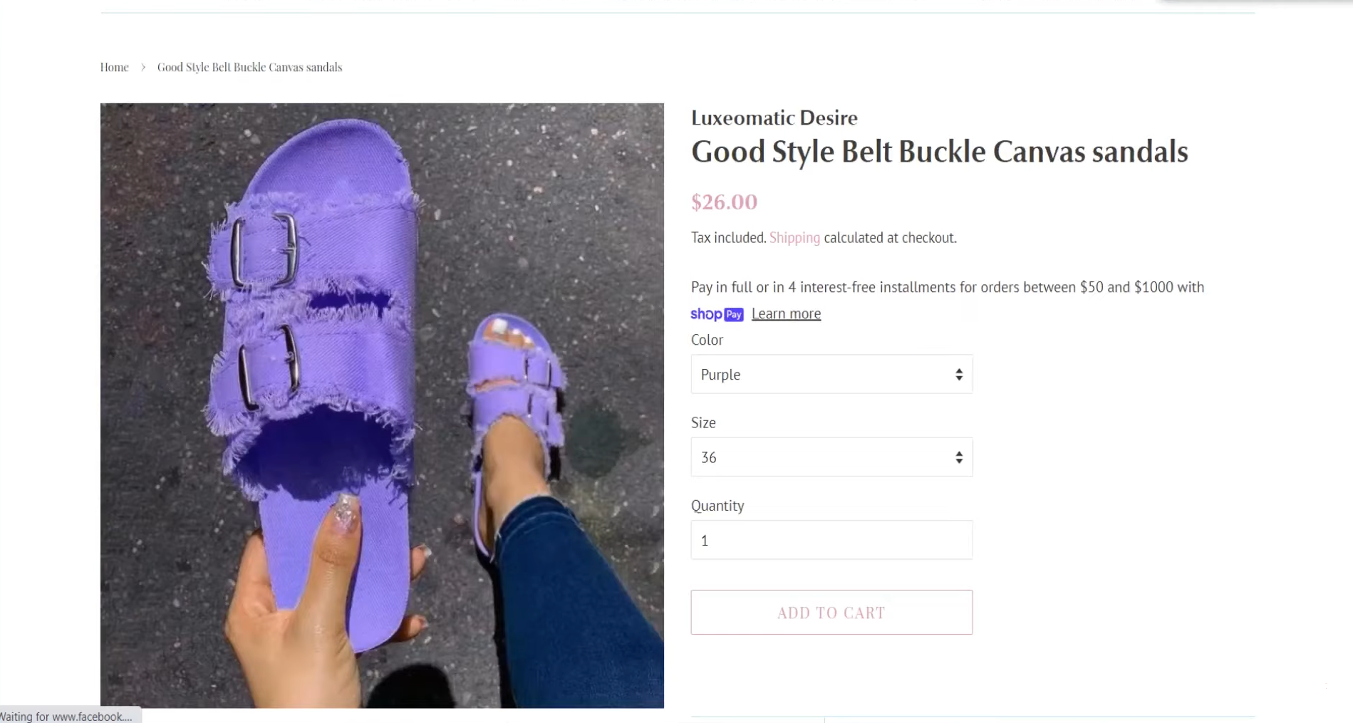
Adding more detailed information in the descriptions can improve the chances of actually selling the product rather than just having a product page with very limited content.
4. Avoid Serif fonts when selling women's items.
Choose the type of font that suits the branding. Serif fonts are not ideal for women's fashion niche websites since they tend to leave a quite masculine expression and it will be less attractive from female customers’ perspective. Try to use sans-serif fonts instead.
5. Add custom content to your site if you are selling women's fashion items.
Adding custom content helps to make your store stand out from all of the other same niche stores. Otherwise, you have to set the price cheaper to keep it competitive.
Example 2. Keepfithealth
*Tips from Elliott:
1. Optimize the loading time.
If you are using flatsome WordPress theme, the loading time seems to be longer which is not good for the customer experience. Try to decrease the loading time by upgrading the hosting provider, reducing image size, deleting unnecessary plugins, etc.
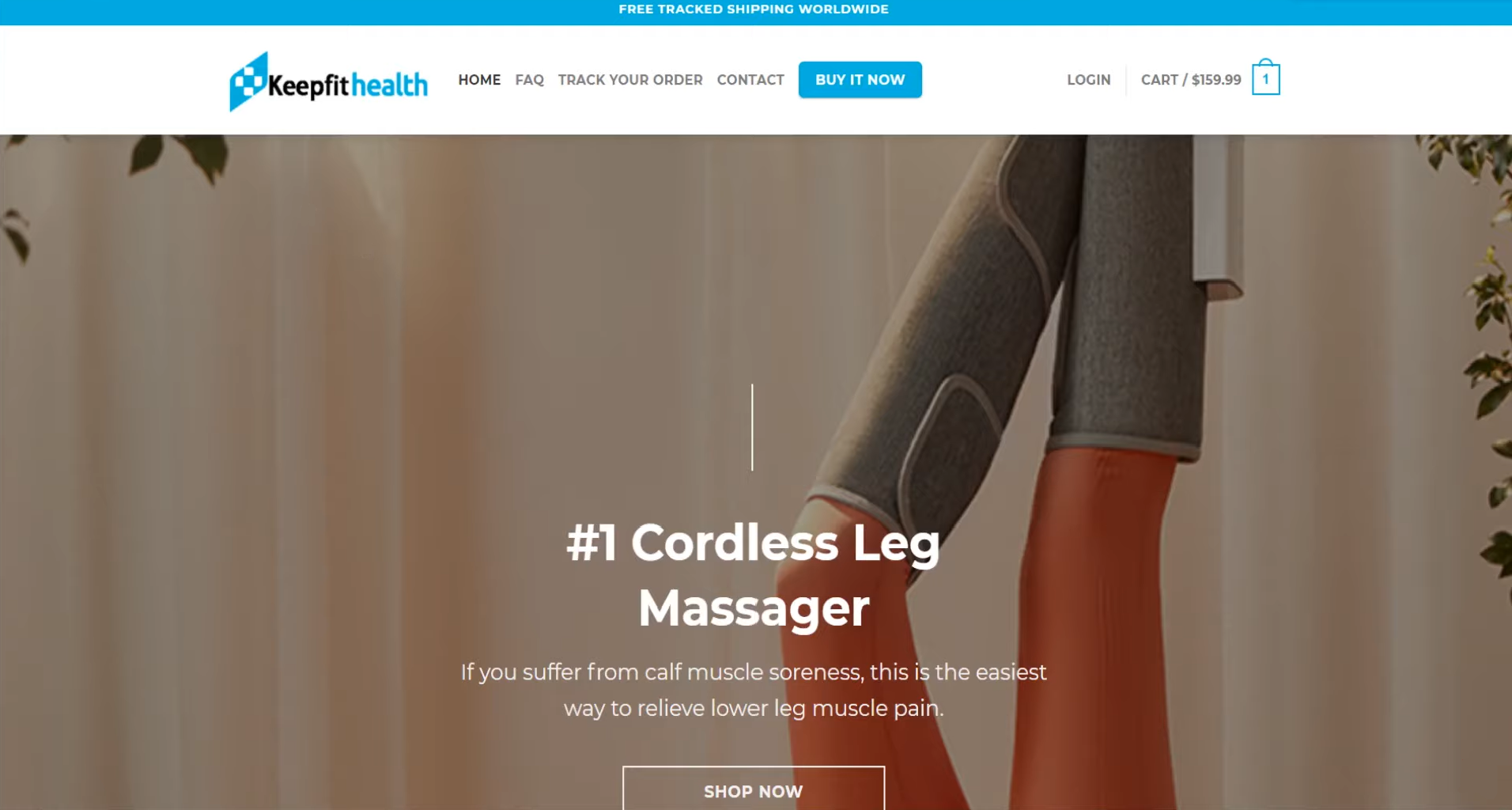
2. Add a “Find Out More” button.
Try to add a “Find Out More” or “Watch Video ” button with an anchor menu item that brings people down to more information about the product instead of just having a “Shop Now” button on your homepage.
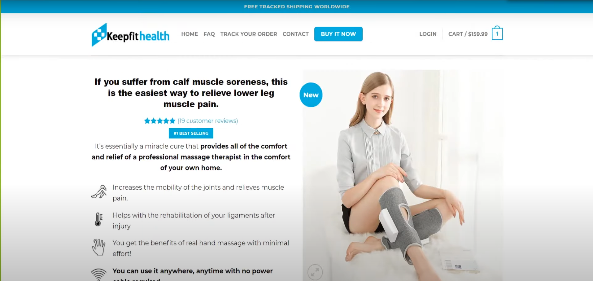
3. Add store reviews somewhere more visible.
Add the “Reviews” button to a more visible place, like the header, etc. It can bring the customer straight down to the reviews. Meanwhile, make sure the review content won’t be looked so cramped, or you’d better space this out.
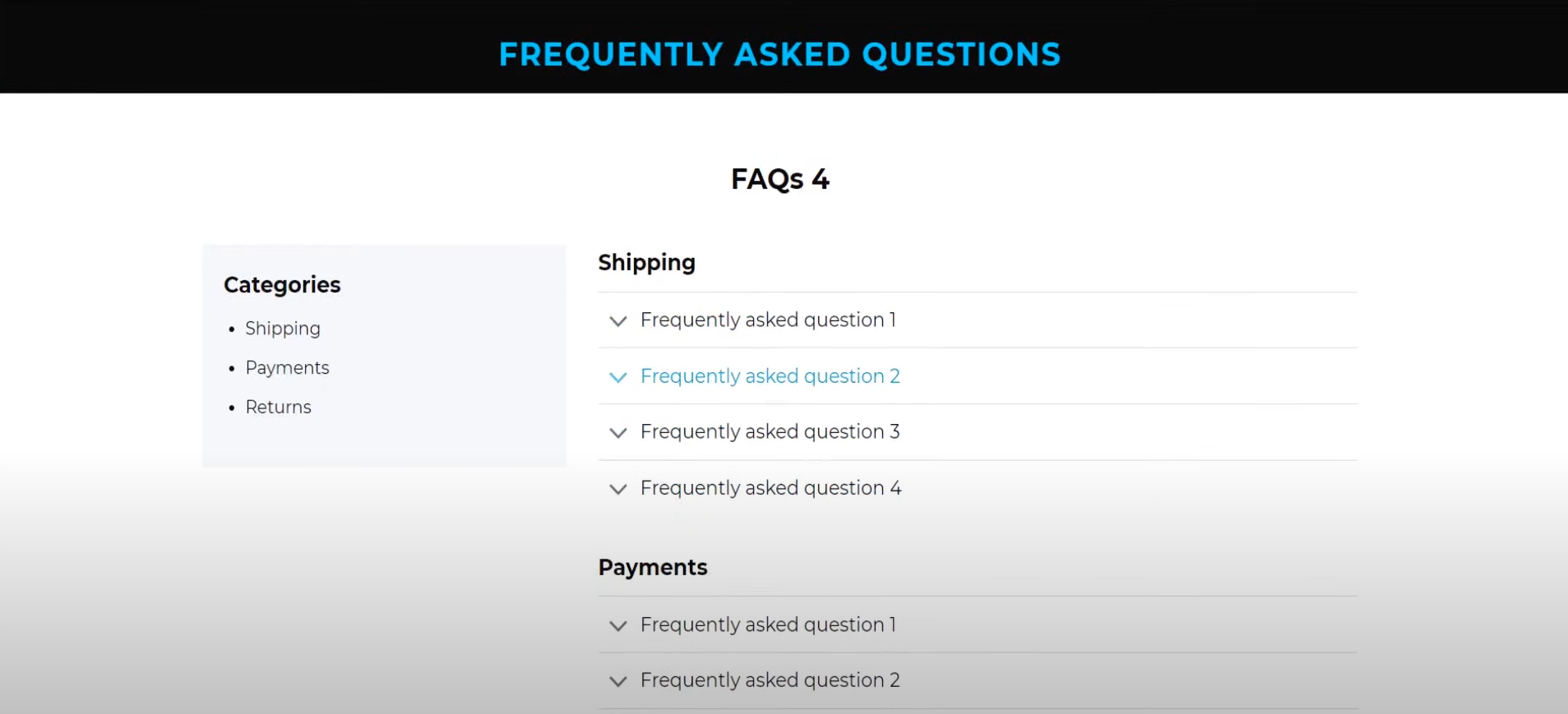
4. Create content for the FAQs area.
To build trust between your site and your customers, it’s necessary to set up the FAQs section well with more information that people may ask.
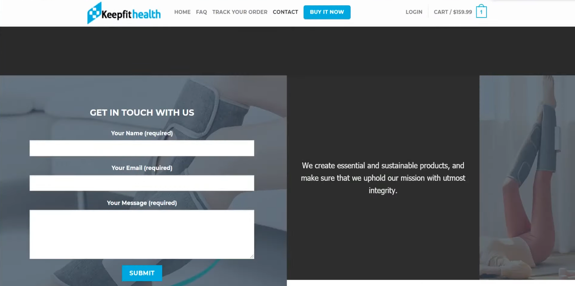
5. Keep the “Contact Us” page simple.
The “Contact Us” page is also more about building trust, so do not try to sell things here. You should keep this page simple and only display the contact form straight away.
Example 3. TheHuggyPillow.com
*Tips from Elliott:
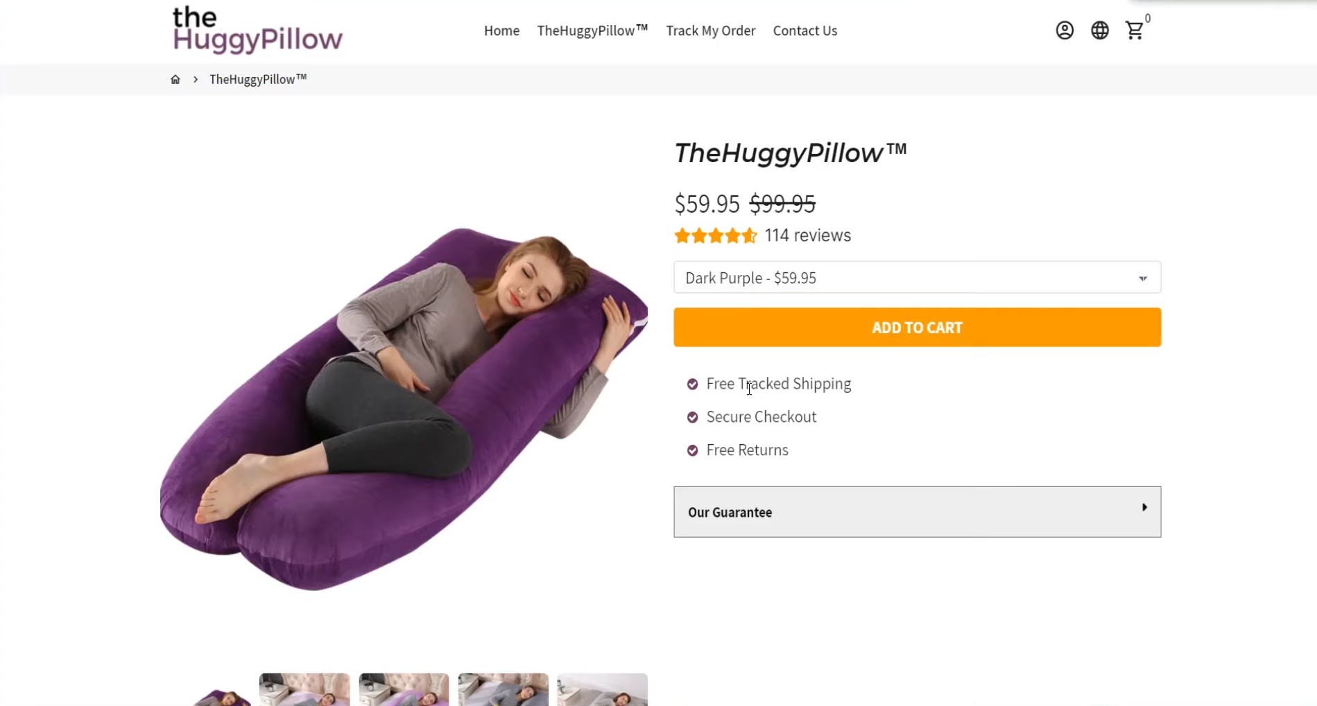
1. Add more information in the initial area of the product description.
Adding more information or offer a gift in the initial area of the product page helps to entice the customers to scroll more about this product by feeding the customers information about the benefits and features.
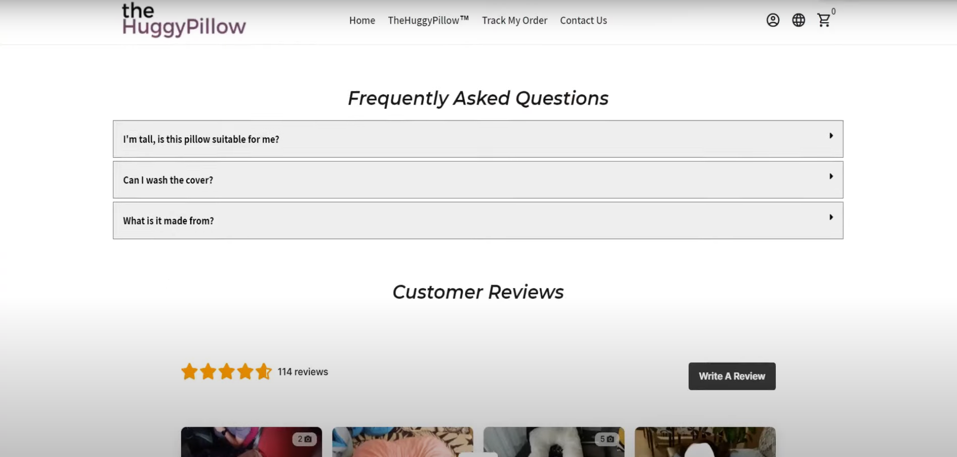
2. Add information about shipping and refunds on the product page.
Try to add some information about shipping and refunds in the FAQs area on the product page. So the customers can stick to the product page with all the information they would like to know and tend to be easier to scroll back and add the product to the cart.
3. Use debutify sticky “Add to Cart” button when scrolling.
Using the sticky “Add to Cart” button on the debutify theme can prompt the customers to add the product to the cart and increasing the possibilities of making a sale for your store.
Example 4. PettingPatrol.com
*Tips from Elliott:
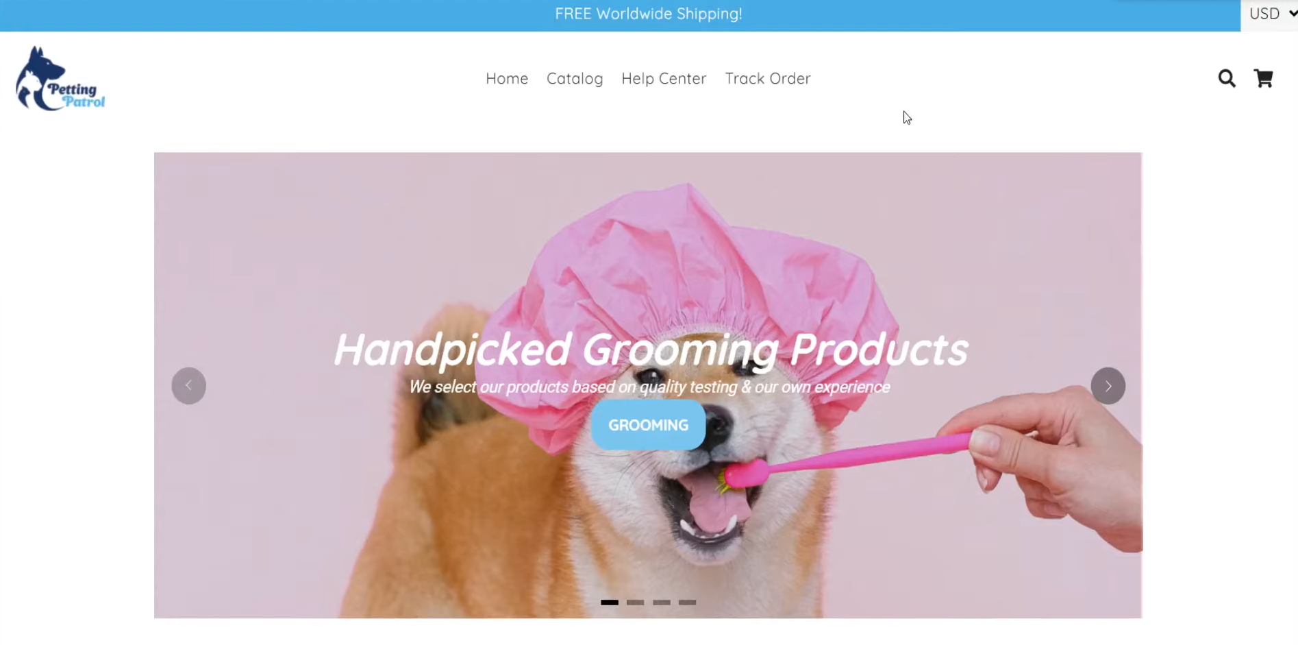
1. To build an audience to help your store stand out.
Since the pet niche is such a competitive niche so it is hard to compete with all the other stores with the products. So building an audience is a way to help you to stand out of the crowd.
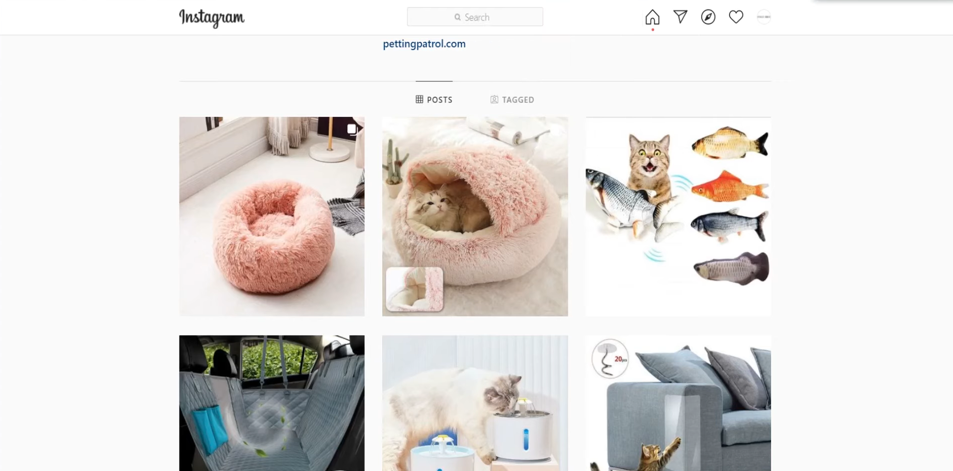
2. Create content for your Instagram.
Try to build a following by creating content that the products can actually improve the audience's life but not simply upload the product images. If you have a pet, you could upload videos about how the products are used to show that they can really improve pet owners’ lives.
Example 5. GoComfit.com
*Tips from Elliott:
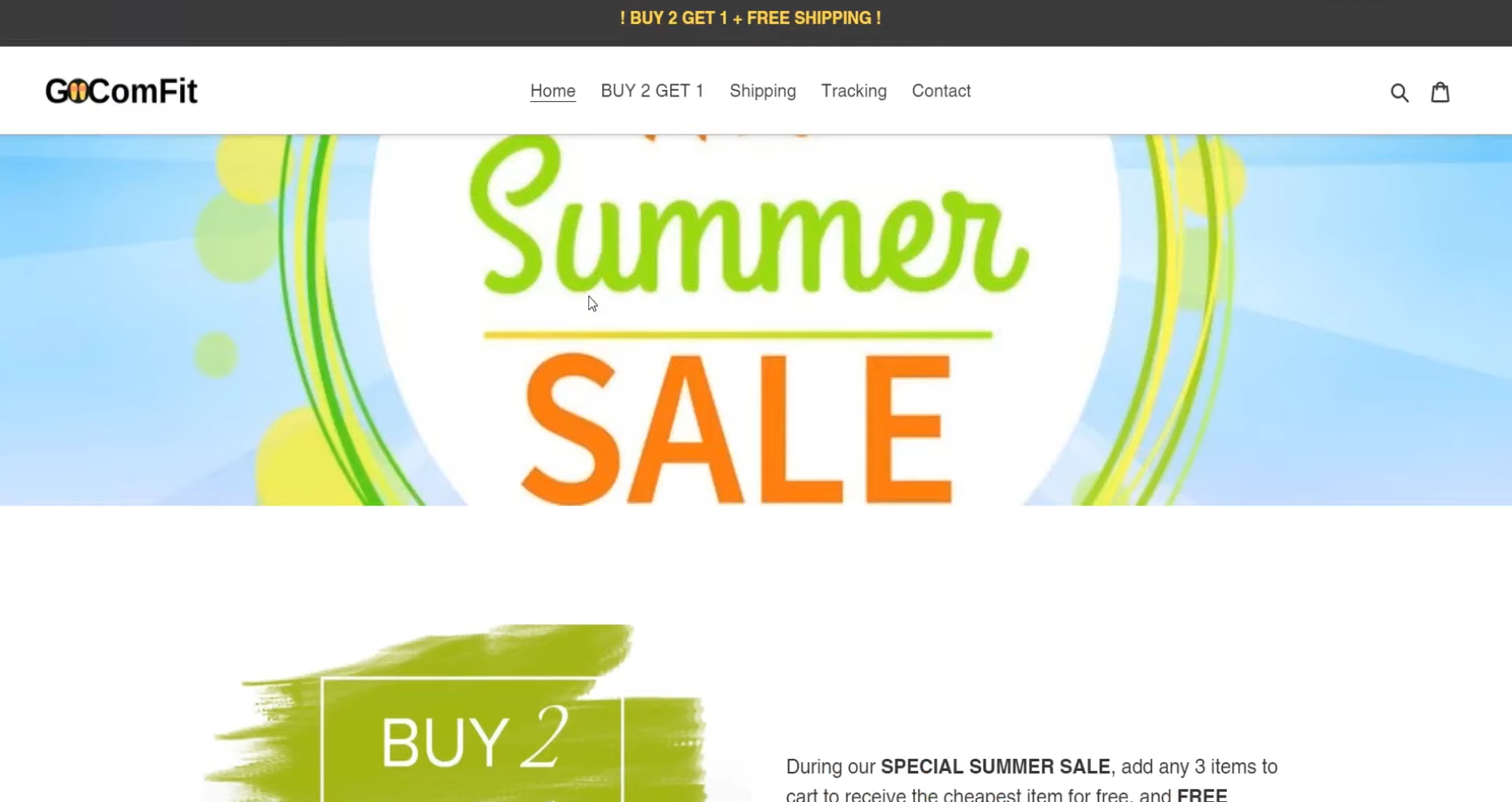
1. Make what you are selling more obvious.
If It’s not immediately obvious what product you are selling then it will make the customers much confused. Try to make your homepage more obvious with what are you selling now.
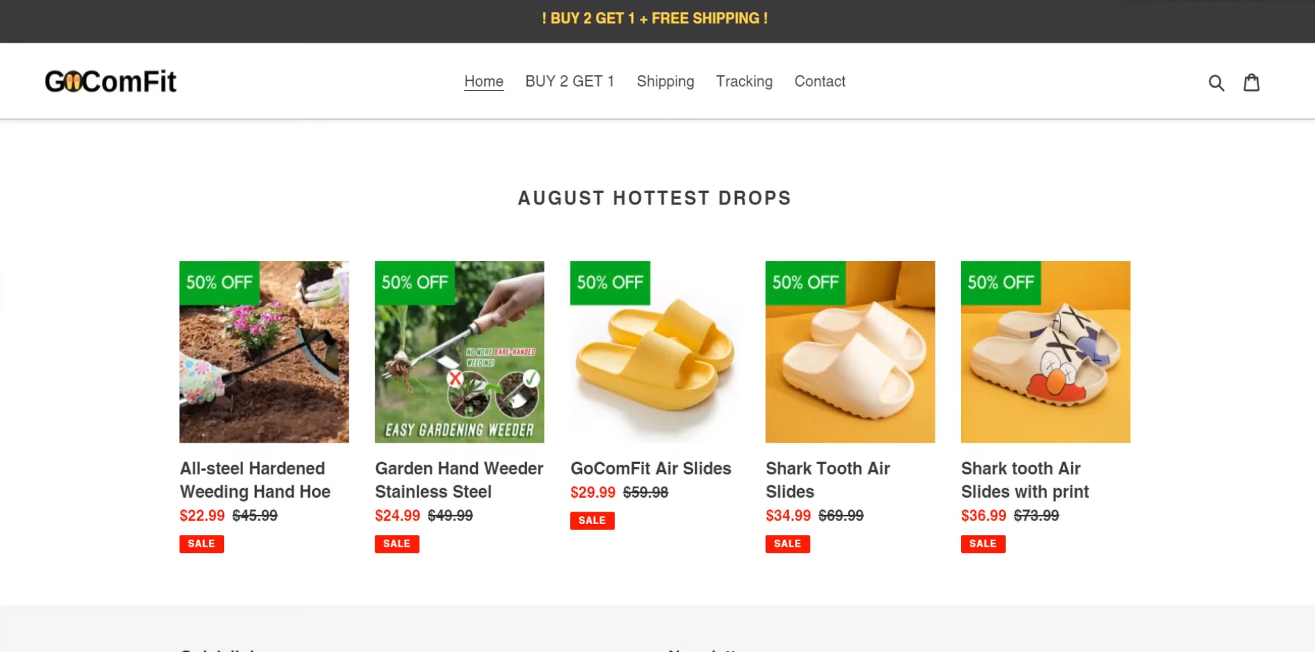
2. Try to find some “WoW Factor” products or pick a niche.
It seems to be hard for a general store like this with a very minimum amount of products, basic products, and not a lot of effort put into branding nowadays. You can try to find some “WoW Factor” products or pick a niche for your store.
Example 6. phoenix-rising-deals.com
*Tips from Elliott:
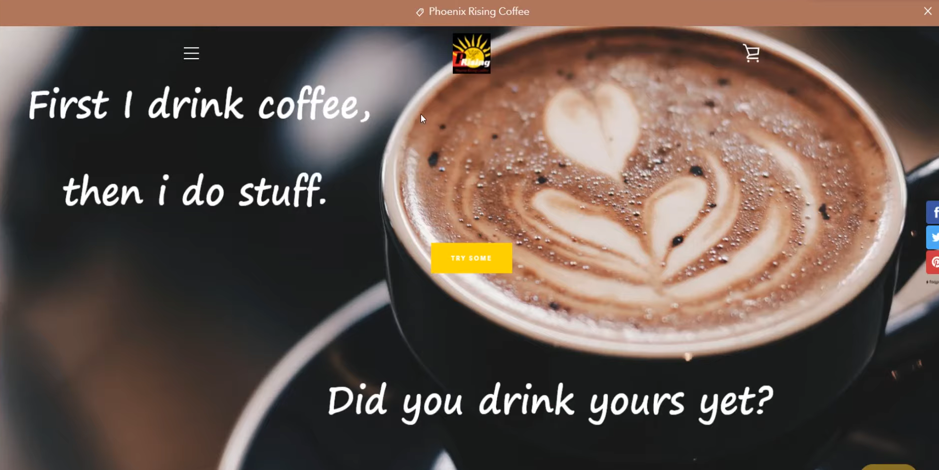
1. Make the logo clean and easy to read.
If you want to make your brand logo stand out a little bit more and instantly recognizable, you can try to change the logo to a cleaner one and also will be easy to read.
2. Choose a font that looks more professional.
The initial font on the homepage looks amateur now, try to change it to a more professional one.
3. Find out some unique selling points.
Since coffee is a really competitive nice. If you are trying to sell your own coffee brand, you have to find out a unique selling point and make it obvious to the customers. You could try to create some custom content, create content about your coffee on social media platforms.
4. Add some content to make the product page stand out.
Try to add some product images, videos of people drinking the coffee, or have some customer reviews about flavor, etc. to make your coffee be different and stand out from others.
Example 7. KitchensFun.com
*Tips from Elliott:
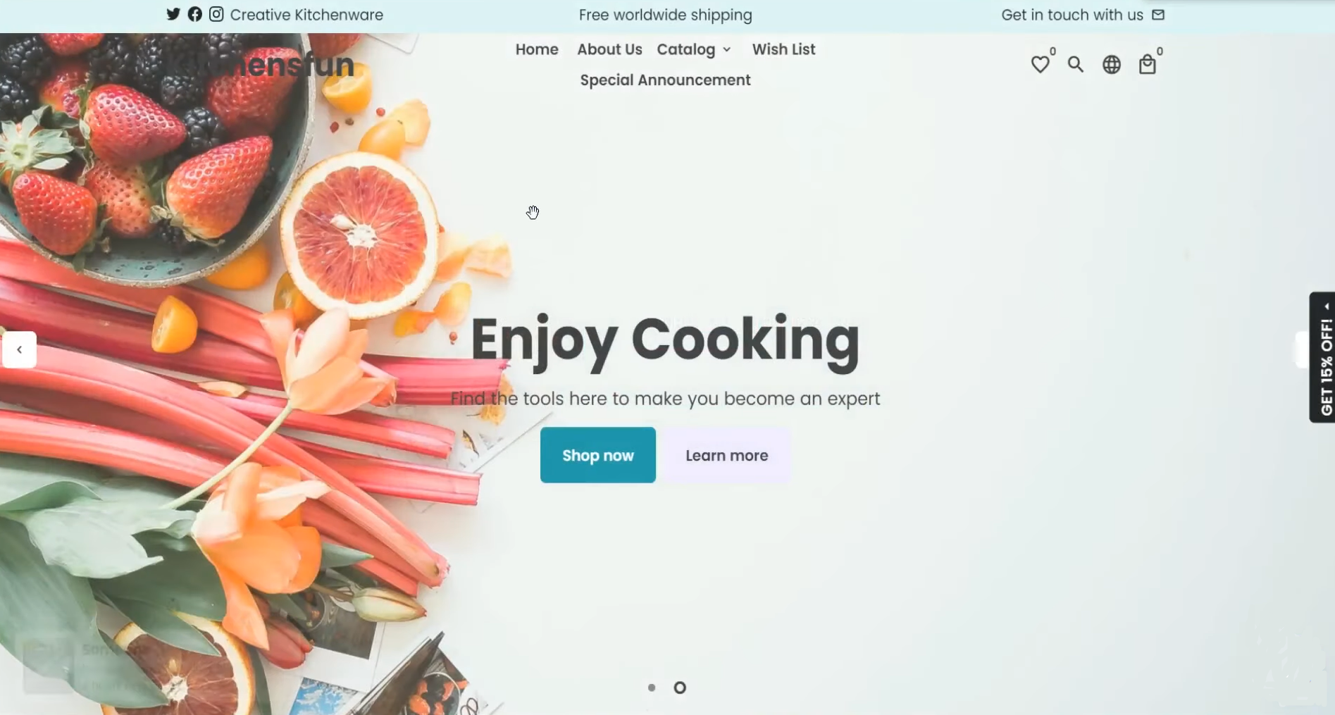
1. Add your logo and make the text more obvious.
You can add your logo on the top left corner of the homepage and change the text color to white to make them more obvious and easy to read.
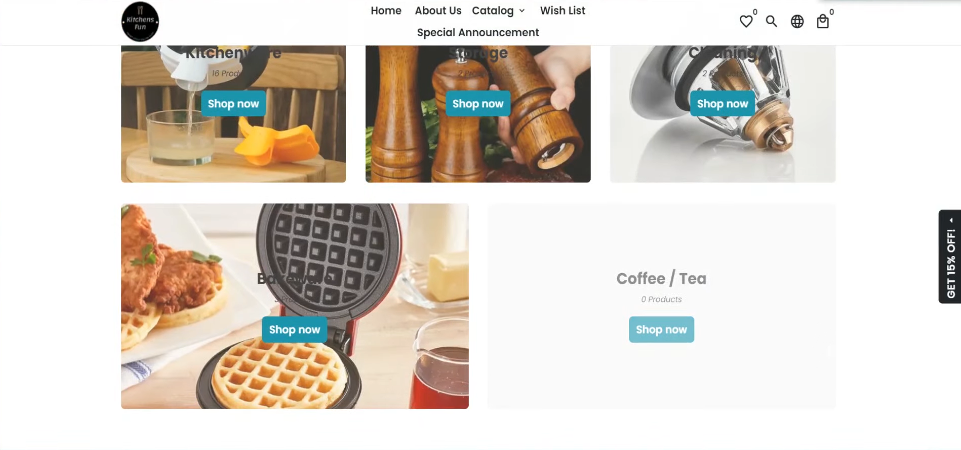
2. Add products to the empty
The customers may feel a little bit weird if they come over and see no product under one section. That will make them lose confidence in purchasing from your store. It is also an important way to build trust with your customers.
3. Change avenues to run ads.
Since the product pricing of this niche is a little bit difficult to make a profit with Facebook ads, you can use another avenue like Pinterest, google shopping, etc. The actual cost of running ads will be cheaper and people are still interested in these types of products.
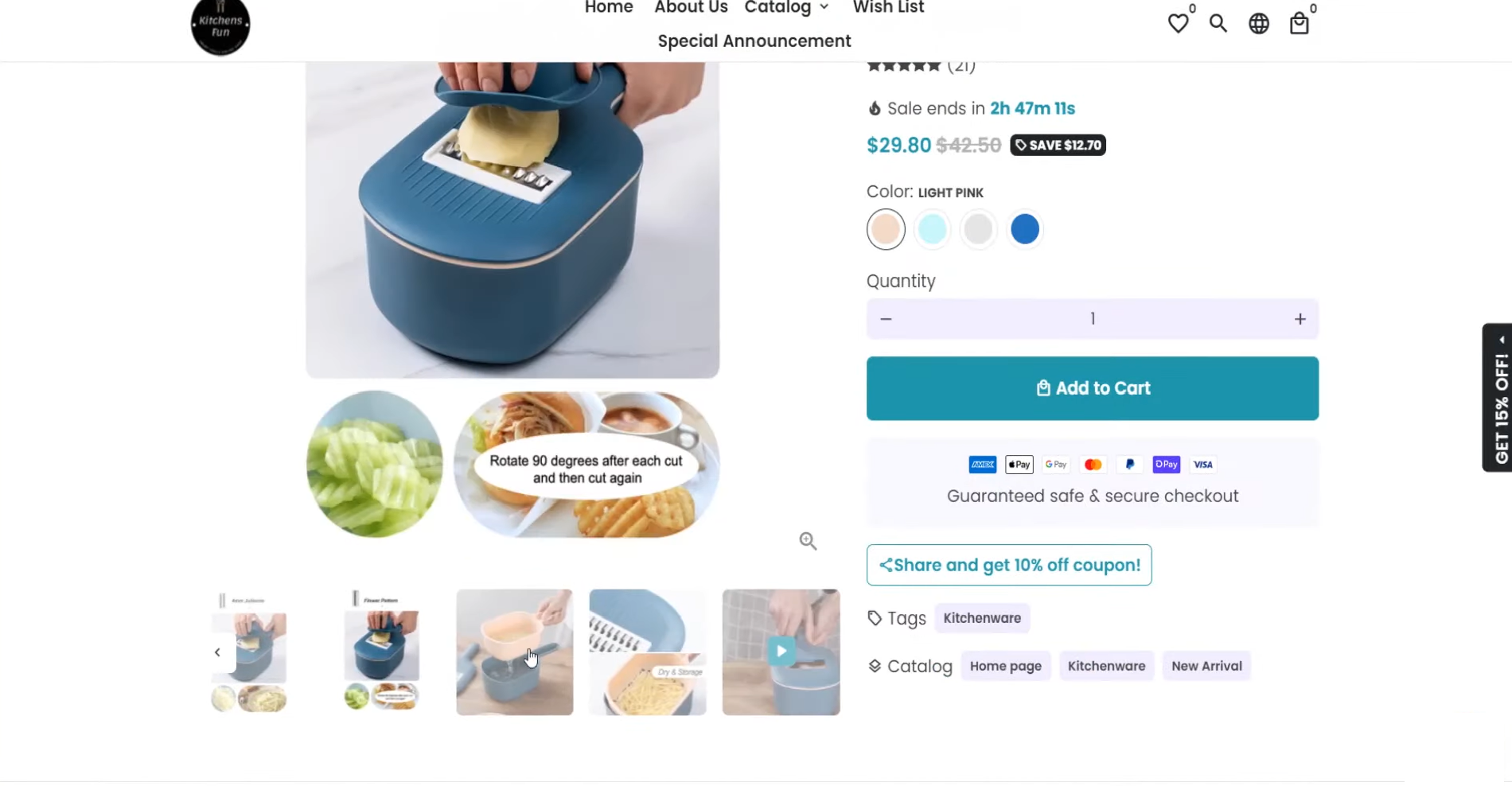
4. Have the video earlier on in your gallery.
You can have the video earlier on in your gallery so that people can see the product straight away by the video. Also, you can put the video in the product description below so that the customers do not need to scroll through to find it.

